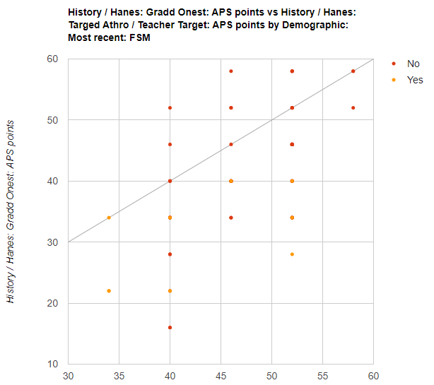
You can quickly and clearly visualise the subject statistics available in GO 4 Schools using the subject charts, which are available by clicking on and using the ‘Visit the subject charts page’ link shown below from the subject home page.

The charts provide the flexibility to view subject information contained in GO 4 Schools through bar charts, pivot tables, scatter plots or residual charts.
TIP: To find out more information and see further examples of how to use the subject charts, you can watch the video titled ‘Using Pivot Charts’. Below you will find a handful of examples as a starting point.
Using a pivot table to compare predicted/final current grade with actuals
To draw a bar chart and pivot table representing the match-up between the final predicted/current and actual grades for your subject, filtered by FSM, select the information shown below. Use the subject predicted grade for the row and the subject actual grade Column. Keep aggregation to ‘count’. You can use either fine grades or whole grades when you select your current/ predicted or actual grades in the column and data selection.
|
Row |
Column |
Data |
Aggregation
|
|
Grades: Grade level: Predicted grade |
Grades: Grade level: Actual grade |
Grades: Grade level: Actual grade |
Count |
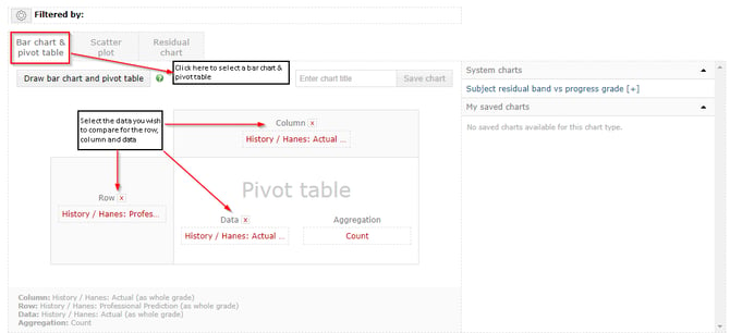
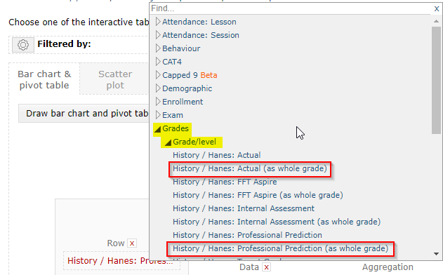
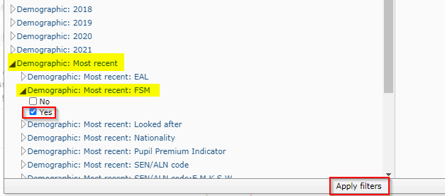
If you click on ‘Draw bar chart and pivot table’ at this stage you will see a bar chart and pivot table showing the comparison for ‘all’ students, as shown in the example below. If you then click on the ‘filtered by’ icon, you will be able to select how you want to filter the bar chart and pivot table. In this example we are going to filter the data by FSM. If you click on the cog icon next to ‘filtered by’ and select FSM ‘true’ from the most recent demographic column you will be able to compare the performance of this focus group.
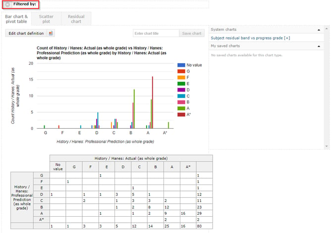
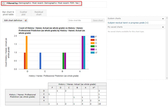
This is a useful view as you can quickly identify the grade differences where teachers may require further training to clearly identify gaps in learning. Further analysis can then be completed to identify class trends.
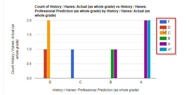
You can also use your cursor icon to hover over the actual grades achieved colouring key. The bar chart will highlight the distribution of values for that grade, helping to identify the spread of data.
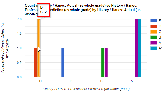
 You can also use your cursor icon to hover over a bar or the table value to identify more detailed information about the values or click on the table value to identify which student or students you are viewing.
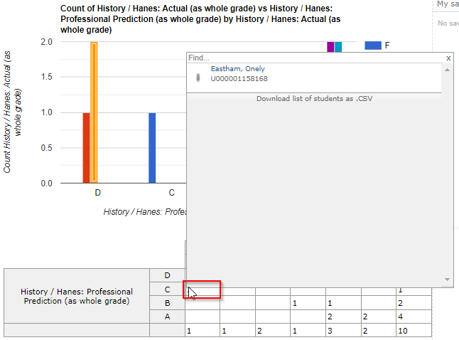
If you then click on the name of the student, you will open the student overview page where you can further investigate the achievement of the individual student in more detail.
Charts can also be given a title, and the fields will be saved for the chart to be quickly re-drawn after you leave and then return to the page:

Additional bar and pivot charts
Other useful bar and pivot charts are shown below.
This chart displays the residual band information based upon your residual settings:
|
Row |
Column |
Data |
Aggregation
|
|
Residual Band – Current to Target |
|||
|
Subject: Grade/level: Residual Band: Current Grade – Target: GO 4 Schools: Current model |
Subject: Group(s) |
Subject: Group(s)
|
Count |
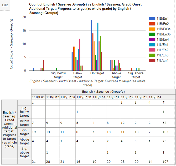
This chart displays the APS of students in the subject broken down by FSM and sex:
|
Row |
Column |
Data |
Aggregation
|
|
APS by FSM and sex |
|||
|
Demographic: Most recent: FSM |
Demographic: Sex |
Grades: APS points: Current grade
|
Average |
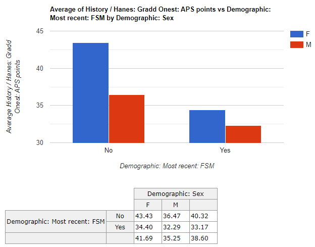
This chart displays the count of report attribute grades distributed across the teaching groups:
|
Row |
Column |
Data |
Aggregation
|
|
Report attribute by class |
|||
|
Groups and teachers: Subject: Teachers(s) |
Grades: Reports/progress: Attributes |
Grades: Reports/progress: Attributes |
Count |
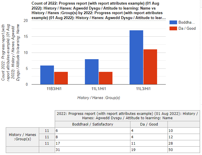
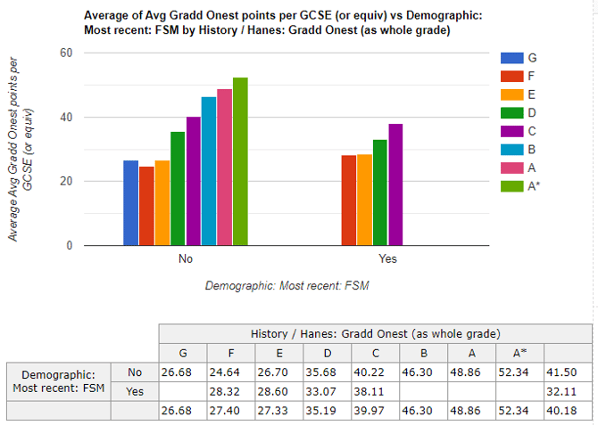
This chart displays the APS across all entries for students on the grade range for the subject. This data is broken down by FSM:
|
Row |
Column |
Data |
Aggregation
|
|
Average grade across all subjects, compared with subject (broken down by FSM) |
|||
|
Demographic: FSM |
Grades: Grade/level |
Grades: Aggregated points: Average points per GCSE (or equiv) |
Average |
This scatter displays the relationship between the progress and target grade by APS:
|
Y-axis |
X-axis |
Colour points by
|
|
Grades: APS points: Progress grade |
Grades: APS points: Target grade |
Demographic: FSM |